MY LESSONS IN PLAY
It is gratifying when a student admits to stubbornness after one or two semesters. Others need longer, so after twenty years I wish to tell my advisors that they were right—and that what I initially proposed as a thesis is now close to completion!
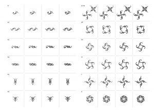
During the first semester break of graduate school, I returned to a typeface that I began previously, Essourira. I enjoyed the graphic form of every character, but do not have the discipline to complete a typeface. When drawing its numerals my attention strayed, and instead, made strange glyphs that intrigued me. I wanted to devote more time and claim as a thesis, but despite my persistence, I offered no valid purpose to pursue as an academic topic. My folly continued as a side project for two years, by which time, a strange alphabet grew to over thirty glyphs and four weights.
This personal project traveled with me to a tenure-track position, and for several years, I turned its soil. I refined the forms, expanded and contracted the number of glyphs and played some more. The long-awaited purpose was revealed to me when seeing how one glyph could be conjoined to form decorative borders, fleurons, and foils. Each glyph then became the root form/motif that was recognizable and recurring in one family of typographic ornament. What follows is the journey of a pet project. After some learning and luck, I have lessons to share with anyone beginning a similar experience.
If not complete, find partial credit.
Tenure loomed and I maintained an active service and professional record while the project received my diminishing attention. A pet project of such endurance mitigated tenure anxiety because I never had idle hands; and though far from resolved, elements of the project found several exhibition appearances to add to the C.V. And among items in my submitted portfolio, my work-in-progress presentation received positive remarks from one external reviewer; two others did not make explicit remarks. I was tenured in 2006 and returned to my passion in the summers of 2008–10.
Without progress, you may not love your project.
Long periods of absence were beneficial because I returned each time with fresh eyes, and consequently, dissatisfaction. In my latest return, the number of families was winnowed to 18; and as proof of concept, I created numerous vignettes of sample text surrounded and peppered with borders, fleurons, and foils. It worked well. One odd trait about each family is that of the four weights, two have either differently shaped or fewer ball terminals. The light and regular weights pair well with script, old style, and transitional fonts. Demi, with its fully round terminal, pairs well with modern and sans fonts, and the bold weight often has one less ball terminal and pairs well with sans and slab fonts.
Patience.
My pet project was not intended to be the cornerstone of a tenure decision or later promotion and I am glad that I did not rush. When I last left it, I joined several team members of other disciplines in an exciting and new, long-term project which continues today. It too required extended periods of exploration and tinkering; and due to my own quest for resolution and then perfection, I have become very practiced in patience. In either instance, both the team and I have only one shot at getting the projects right.
If you don’t visit, at least talk about your project.
By 2015, I hadn’t followed lesson 2. It had been five years since the project went dormant and I applied for a sabbatical to complete, as well as produce a sales tool; i.e. specimen sheets, brochure, et cetera. I didn’t receive the sabbatical following a competitive selection process but applied again, wary of needed adjustments. Firstly, I had not been present in the work, nor practiced at articulating it—particularly to non-designers. In my next proposal, I used fewer industry terms in consideration of sabbatical committee members from other schools and found a tough editor who was familiar with the selection process. In my previous proposal, I mentioned the many years spent and the ensuing absence which did not benefit the score for one criterion: the probability of completion. Another issue to overcome was that I did not have a letter from a publisher or gallery to demonstrate need or interest in the project. Furthermore, printed ephemera does not share the same prestige as a book so I needed to elevate the status of my work by expressing its originality.
If time or funding is to be granted, be resolute.
My editor shared valuable tips, but also I had a revelation. My first proposal for the sabbatical was met with the same suspicion (warranted) as when it was just a seed in graduate school. I left too much for readers to infer that I was going to return to play and also had conjectured two possible outcomes following completion. That was a mistake; stating one goal is better than more. My next proposal was more compelling, clear and described one resolute goal. I received a sabbatical for spring 2017.

Parcel the project.
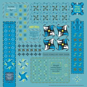
When the sabbatical term arrived, I pulled the project from my digital oaken barrel and saw that it hadn’t aged well. I know that it is no longer acceptable parenting practice to spank children but I did—in trimming the 18 families to 12. The dozen families each contain six borders, fleurons, and foils in four weights. Borders consist of an edge tile glyph and a corner tile glyph which then account for nearly 100 unique glyphs per family. I divided the families into two equal volumes of six to make my task manageable—one volume for early release and one for later. The reduction was not enough to satisfy me so I redrew many faulted glyphs and replaced many others with less static inventions of the earlier “root” forms mentioned above. This period of quality control was planned for the semester but under budgeted. Though I was to focus on completion, my continued play revealed another discovery: a fleuron or foil could connect with each other to construct, for instance, a “super fleuron” or new foils and borders. Creating more opportunities for such combinations became a goal when replacing the less appealing glyphs.
Completion.
Completion of a project is obvious, but this header permits the end of my project’s narrative to date. In early 2017, I applied for and received funding from the Hartford Art School Endowment Inc. Faculty Development Fund to print six posters displaying volume 1. These essentially were oversized specimen sheets. A bonus lesson: “specimen sheet” is jargon to avoid in writing proposals. The printing was completed at the beginning of summer and by season’s end, I finished revisions of volume 2 with sustained momentum. Following the same schedule, another faculty development fund helped complete the entire project this year. Although I had stated one goal in my sabbatical proposal, I actually am still considering two. Describing each would lead to promotion and space is short.
I once wondered if I had a hidden fear of concluding my project, but the time afforded for sabbatical activity proved that was a false notion. I enjoyed reflecting and invite more lessons.

John Nordyke is Professor of Visual Communication Design and Chair of Applied Arts at the Hartford Art School, University of Hartford.