

Designers, educators and students are bound by ethical considerations to convey information accurately. When designing data visualizations, it’s essential that we are concerned with the accuracy and integrity of the relationship between visual forms and the underlying data the forms represent. Our visual perception is remarkably sensitive and accurate when evaluating one-dimensional relationships, such as the lengths of lines or bars. However, comparing two-dimensional relationships is much more difficult because our internal process is first perception, then cognition.
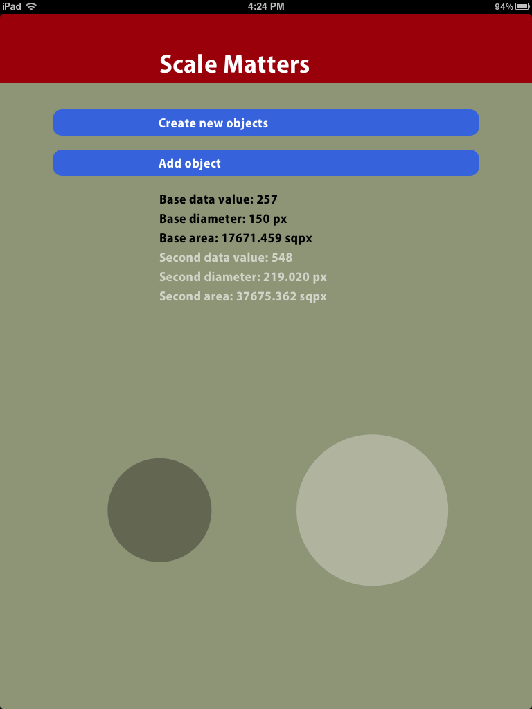
Vertical bar charts allow users to compare the height of equal-width rectangles, accurately representing one-dimensional data (one variable – a single set of values) by extending a two-dimensional shape in one dimension. A problem arises when a designer attempts to represent one-dimensional data by proportionally scaling both width and height of two-dimensional shapes, such as circles. For example, let’s say that we need to visualize the relationship between two data values: 4 and 8. If we set the diameter of one circle to be twice the diameter of the other, the surface area of the larger circle is actually four times larger than the smaller circle – not a very accurate visualization. So, how would designers or design students easily scale two-dimensional shapes that accurately represent data relationships?
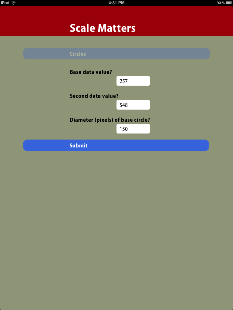
Scale Matters is a responsive mobile web app that was created for graphic design students at California State University, Chico. A user inputs two data values and the diameter of the initial base circle in a visualization. The app calculates the diameter of the second circle that would produce an accurate visual relationship between the surface areas of the two circles.
Access the Scale Matters app from an iPhone 5 or iPad.
www.farmapp.info/scale_matters