

In Conversation with Isabel Bo-Linn
Design Educator Profiles
We are excited to share profile conversations highlighting members of the DEC Community, focusing on featuring the many roles we hold as educators in various institutional settings and job titles. In this month’s edition, we spotlight design educator Zenab Bastawala.
What is your favorite course to teach and why?
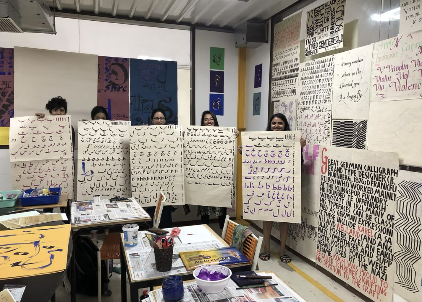
Typography is my favorite course to teach because it sits at the core of how designers learn to see. It’s often the moment when students realize that letters are not neutral carriers of content, but living forms shaped by history, culture, technology, and use.
I love teaching typography because it slows students down. It asks for attention—to spacing, rhythm, hierarchy, and detail—and rewards patience. Watching students move from treating type as decoration to understanding it as a system of relationships is incredibly rewarding. Typography trains both the eye and the mind.
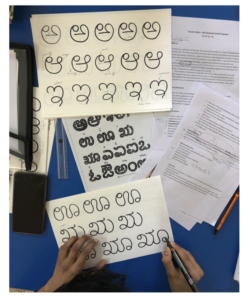
The course also creates space to talk about broader ideas I care deeply about: language, power, multilingualism, and the politics of legibility. Whether we’re working with Latin scripts, Indian scripts, or vernacular lettering, typography becomes a way to discuss identity and context, not just form.
Most of all, typography teaches discipline and flexibility at the same time. It gives students a strong foundation of principles, while encouraging them to adapt those principles across media, cultures, and technologies—qualities that are essential for thoughtful, sustainable design practice.
What have you read recently that really resonated with you?
Right now I am reading: The Birth of a Style: The Influence of the Basel Educational Model on Swiss Graphic Design Book by Dorothea Hofmann. It often resonates because it gives language to instincts you may already have: slowing down, caring about structure, and believing that design education should shape how you think, not just how your work looks.
What is something you teach now that you weren’t taught yourself? How does this add value to your teaching or practice?
Adaptability in design is something I have learned through lived experience—moving between countries, cultures, and educational systems throughout my journey. Each transition reshaped how I see design: not as a fixed style or rigid methodology, but as a responsive practice that evolves with context, people, and place.
Studying and working across different cultural environments taught me that design values are not universal; they are negotiated. What remains constant, however, is the need to listen—whether to language, material, history, or audience. Adaptability became essential not only for survival, but for meaningful engagement. It pushed me to question assumptions, unlearn habits, and remain open to alternative ways of making and thinking.
This perspective has deeply shaped my practice as both a designer and a teacher. As a designer, adaptability allows me to draw from diverse typographic traditions and production methods—moving fluidly between hand-crafted processes and contemporary systems. As an educator, it informs how I teach: encouraging students to see design as a flexible framework rather than a prescribed outcome, and to respond thoughtfully to changing contexts, technologies, and cultural narratives.
Adaptability, for me, is not compromise—it is a form of rigor. It is the ability to remain grounded in principles while evolving in practice, and to treat design as an ongoing conversation rather than a finished statement.
How do you find balance in your research, practice, and non-academic life?
Honestly, I don’t think I find balance so much as I continually adjust it—and that mindset has helped me make peace with the messiness of it all.
In research and practice, there are periods of deep immersion where boundaries blur: reading, making, teaching, and thinking feed into one another. I’ve learned to accept those cycles rather than fight them, while staying aware of when intensity turns into exhaustion. Design research, especially when it’s tied to culture and pedagogy, doesn’t switch off cleanly—but it does need pauses to stay meaningful.
What helps is being intentional about rhythm rather than balance. I build in moments of slowness through hands-on making, walking, or time away from screens—activities that reconnect me to materiality and observation, which ultimately strengthen my academic and creative work. Non-academic life isn’t separate from my practice; it’s where curiosity is replenished and perspective is regained.
As a teacher, this balance also becomes a responsibility. Modeling adaptability, rest, and reflection shows students that sustainable creative practice matters just as much as productivity. Balance, for me, is not equal time—it’s knowing when to lean in, and when to step back, without guilt.
If money, time, and resources were a non-issue, what is your dream course (or workshop) to teach and why?
Bilingual Design as a cultural, typographic, and pedagogical practice—not simply as translation, but as a way of thinking, seeing, and designing across linguistic worlds.
This course would begin from the belief that language is never neutral. Scripts carry history, power, rhythm, and memory, and bilingual design sits at the intersection of identity, migration, and communication. Having moved between countries and educational systems myself, I’m deeply interested in how designers navigate multiple languages—visually, culturally, and ethically—and how this negotiation shapes more inclusive design outcomes.
The course would be studio-based and research-driven. Students would study bilingual and multilingual typographic systems—from Indian scripts to Latin-based systems—examining how form, proportion, and directionality affect meaning. We would look at vernacular signage, colonial and postcolonial design histories, public lettering, and contemporary type design that resists dominance of a single “global” visual language.
A key focus would be equity in visual hierarchy: how designers decide which language leads, which follows, and why. Students would question defaults, challenge monolingual grids, and design systems that allow multiple scripts to coexist without one being reduced to ornament or afterthought. Letterpress, hand lettering, and digital tools would all be part of the process, emphasizing material understanding alongside conceptual rigor.
Why this course matters to me is simple: bilingual design reflects real life. It mirrors how people speak, read, and move through the world. Teaching it is a way to validate diverse voices, slow down design decisions, and encourage students to design with culture rather than over it. Ultimately, this course would aim to cultivate designers who are adaptable, culturally aware, and confident working between languages—seeing bilingualism not as a constraint, but as a powerful creative resource.
What is something you’ve recently learned? This can be a skill or knowledge, academic or non-academic.
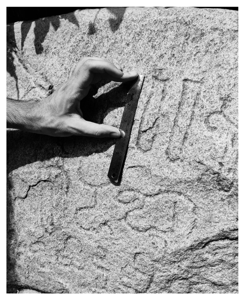
Recently, I studied an online course in Latin Palaeography of the European Middle Ages at Durham University, and it has fundamentally reshaped how I think about writing and design. Learning to read medieval scripts—often inconsistent, abbreviated, and deeply contextual—made me slow down and pay closer attention to form, rhythm, and intention. Each letter becomes an act of decision-making rather than a standardized shape.
What struck me most was how writing functioned as both communication and material practice. The relationship between the scribe, the tool, the surface, and the reader felt remarkably close to contemporary concerns in typography and letterform design. Studying palaeography highlighted how meaning emerges through use, error, and adaptation—ideas that resonate strongly with my interest in vernacular type and bilingual design.
Beyond the academic value, the course sharpened my visual sensitivity and patience. It reinforced the idea that legibility is historically contingent, and that systems we now consider “rules” were once flexible conventions shaped by time, place, and human hand. This learning continues to inform my approach to design, reminding me that letters carry lived history, not just form.
Where can we usually find you in your off-time?
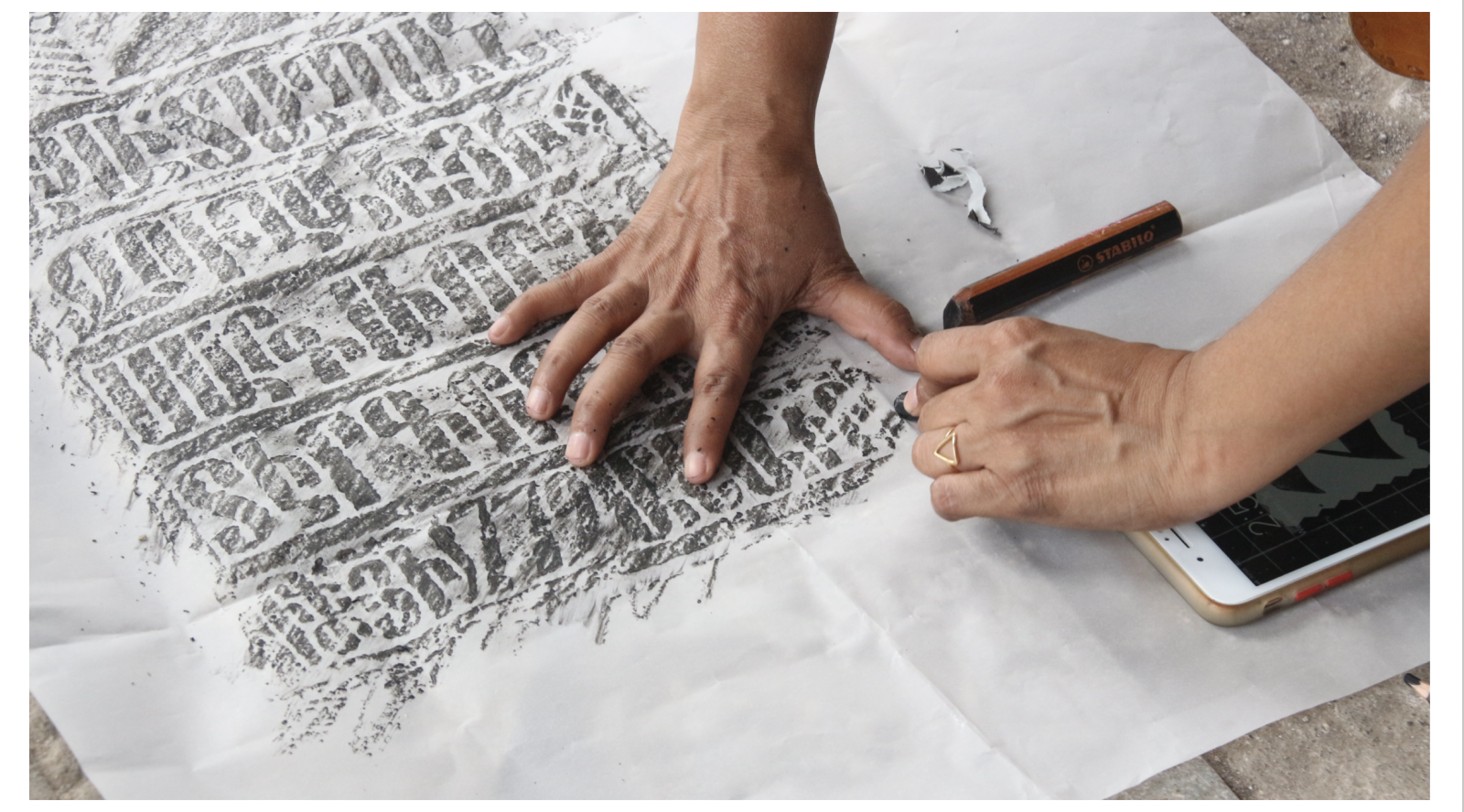
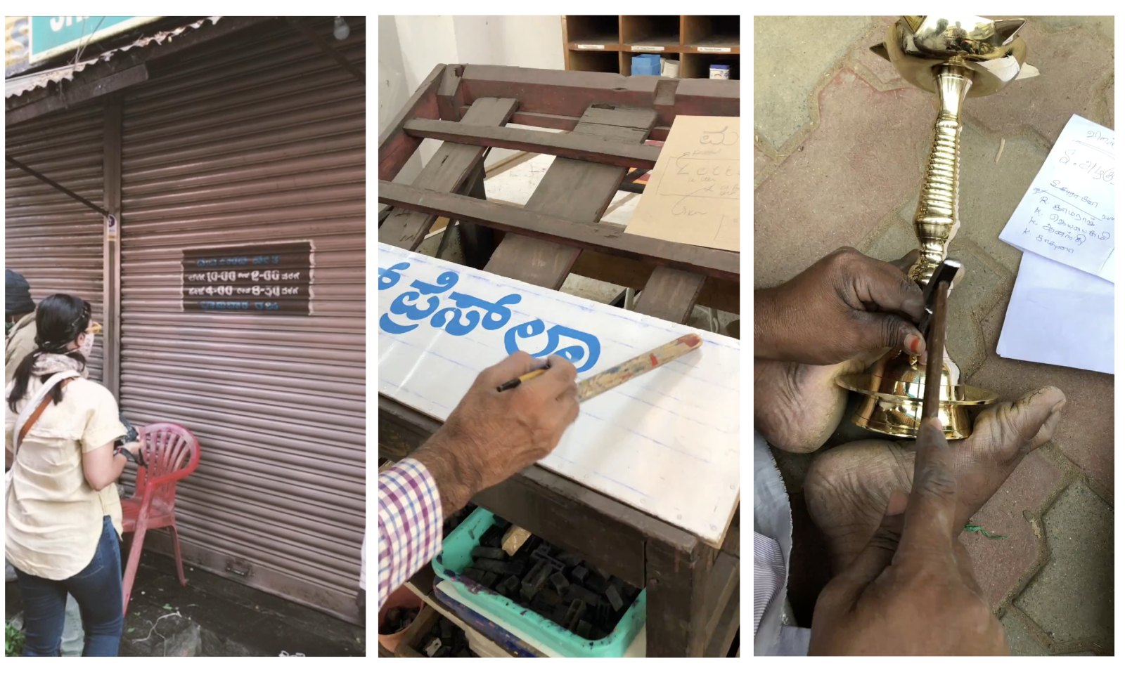
In my off-time, usually gravitating toward spaces that slow things down and bring me back to observation. I spend a lot of time walking—through neighborhoods, markets, and streets—paying attention to signage, lettering, color, and the quiet design decisions embedded in everyday life. Those walks often become informal research without the pressure of an outcome.
I’m also drawn to hands-on making outside of academic expectations: experimenting with print, collecting ephemera, sketching letterforms, or simply working with materials without a brief. That kind of unstructured time helps reset my relationship with design.
And when I’m not making or observing, I’m likely cooking, listening to music, or spending time with people I care about—moments that remind me that creativity is sustained by life beyond the studio. Off-time, for me, is less about disconnecting and more about reconnecting in quieter, more intuitive ways.
Do you have any advice for other educators?
One piece of advice I return to often is this: teach ways of thinking, not just ways of making. Tools, software, and trends will change, but how students observe, question, and respond to context will stay with them far longer.
Create space for slowness and curiosity. Let students sit with uncertainty, make mistakes, and revise their thinking—not just their outcomes. Some of the most meaningful learning happens when students are allowed to struggle productively and reflect on why something works or doesn’t.
Adaptability is key, especially in design education. Meet students where they are—culturally, linguistically, and intellectually—and recognize that not everyone enters the classroom with the same references or confidence. Flexibility in teaching methods doesn’t dilute rigor; it strengthens it.
Finally, model the behavior you hope to see. Share your process, your doubts, and your ongoing learning. When students see educators as active practitioners and lifelong learners, it gives them permission to stay curious, humble, and engaged well beyond the classroom.
Zenab brings a multi-script and multilingual perspective to her teaching of typography and graphic design. She holds an MA in Typeface Design from the University of Reading, UK, and a Bachelor’s in Visual Communication Design from Swinburne University, Australia. An educator, typographer, graphic designer, and a letterpress aficionado. Zenab’s interests lie in the history of printing and book typography, particularly in bilingual contexts and traditional printing techniques using metal type. She is the founder of Sign Walks, a platform that critically explores urban signage through the lenses of history, language, and the evolving nature of cityscapes. She has presented her research and insights on typography both nationally and internationally.
This conversation was led by AIGA DEC Steering Committee member Isabel Bo-Linn, Assistant Professor of Graphic Design at Portland State University.