Every Friday I walk to a neighborhood kiosk here in Skellefteå, Sweden, to pick up the week’s expired posters advertising Swedish women’s magazines. These exuberant if not stupefying designs are on display daily outside kiosks throughout this small city on the edge of Lapland.
I’ve been coming here for years, but only this past summer did I start collecting posters. With the help of the kiosk owner, Agnetha, I’ve quickly amassed a sizable number. Making sense of them, however, has come slower, like my mastery of the Swedish language.
I started the collection of posters because I was drawn to their sensational and mysterious designs. There are always just enough words I don’t understand and bold compositional juxtapositions to make them intriguing. But this past summer I was hoping they could teach me something about Swedish culture, or at least provide insight into it. I was also driven in part by a project I regularly assign my students: analyze a place and respond to it with a point of view. I’ve given this project to many students new to the United States; now that I’m in Sweden for an extended period of time, I undertook the project myself and experienced the role of outsider first hand.
Promoting home decorating ideas, recipes, and the latest fashions, the women in these prominently displayed posters suggest ideals to be emulated, values to be adopted or, conversely, behaviors to be frowned upon. Agnetha says, of the magazines’ celebrity depictions and accompanying headlines, that while they generate discussion at the checkout, nobody takes them seriously.
I’ve studied the collection through a range of interpretive lenses, but it wasn’t until I began paying closer attention to other visual portrayals of women here that I developed a level of understanding. While the portrayals may be found anywhere, the fact that they are in Sweden (a model of all things good) was at times surprising and disappointing, but also illuminating and reassuring.
The interpretive process raised questions about societal value and cultural authenticity, as well as the role of men. I was curious what could be learned about the narratives embedded in the posters (e.g., woman as primary caregiver) by studying the strategies and approaches used in other Swedish posters and signs that featured women.
The images accompanying this essay were seen in a single day, and express a range of women’s roles and situations in Sweden. Here’s what I experienced on a recent Friday in Skellefteå.
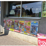
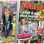
I first walked to the kiosk to pick up the week’s expired posters. They included gossip about celebrities in bikinis but also methods of hosting dinner parties with elegance. Unlike in previous weeks, Agnetha had folded these posters several times over, creating interesting visual juxtapositions such as an image of a blueberry pie next to an upside-down headline in shocking hot pink.
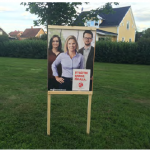
Next, I drove to a nearby grocery store and along the way saw political posters for an upcoming–now completed–national election, the majority of which contained women candidates. Every political poster was on public land or attached to city property, suggesting a high value on supporting public expression. In Sweden, there are more than just two viable parties, including a feminist party. These posters all take the same approach: a candidate looking directly and confidently at the viewer, accompanied by a short message set in simple typography. It’s all rather matter-of-fact, take it or leave it.
The candidate shown in the accompanying picture of the poster is a member of the Social Democratic Party with a message of “Create a Better Sweden for Everyone.” (The Social Democratic Party is left of center politically and received the majority of votes in the election.) While the statement is admittedly so broad as to be meaningless, at least the design avoids empty patriotism by excluding the Swedish flag (a symbol co-opted by the extreme far-right to represent them), national colors and emblem, and the unofficial national symbol of the Darlana horse.
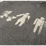
Once at the store I parked in the family-parking row. The designated parking symbol that guided me was baffling. Its suggestion that caregiving is the mother’s responsibility doesn’t correspond to Sweden’s progressive policies of gender equality. Here, both women and men receive up to 18 months of paid maternity leave after a child is born. And in Skellefteå, it’s mandatory that all boys learn to sew and cook beginning in elementary school.
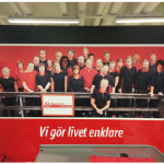
Inside the store and behind the checkout area was a large welcome sign with pictures of the employees. A closer look revealed that the faces of new employees were simply pasted over those of former employees. While the store’s almost equal number of female and male employees may suggest broader workplace gender equality (Sweden is among the countries with the highest percentage of women in the workplace and lowest wage disparity between men and women), the pasted faces certainly imply interchangeability and replaceability.
On the way home I stopped to talk with Anna, a woman hitchhiking to Haparanda, a small city about three hours north on the Sweden–Finland border. She was alone but unconcerned about her safety, explaining that she deliberately chose to hitchhike for the experience of meeting others. Her exuberant and emotive typography matched her spirit.
Additional posters and signs I saw that day, but didn’t photograph for various reasons, included a school zone traffic sign depicting a confident girl guiding a younger boy across the street, and a “sign,” in a semiotic sense, held by a woman asking for donations. In this case the sign was a branded but worn paper coffee cup from a local coffee shop. Ironically, and according to the locals, only the wives and girlfriends of the city’s professional hockey players can afford to frequent the coffee shop.
What I experienced that day is a glimpse of a many-layered culture from which any number of narratives could be derived. The one I created has a simple linear structure and is told from a single point of view. The narrative arc does not reach a dramatic conclusion, but only the following analysis.
The posters and signs exhibited a variety of purposes, were derived from different motivations, and used a similar rhetorical approach: rational and instructional, with little emotion. It was all very civil. I felt I was being addressed as an adult. The exception was the women’s magazine posters, which were the most overtly persuasive and employed a broader range of visual devices. In these, some images functioned as metaphors, such as a photograph of a blueberry pie to connote comfort and nostalgia, and some typography was mildly interpretive, such as the shocking hot pink bold headline. Most of what I saw that day furthered the ideal of simplicity and reduction.
My study of the magazine posters has given me a better sense of the disorientation some of my students must feel—as well as the joy of discovery—and reinforced my belief that searches beginning with simple curiosity, diverging in part through serendipity, and whose pieces are connected later, often result in unexpected and rich layers of meaning. Throughout the process, keeping an open mind, being critically reflective, and seeking out information that might explain cultural idiosyncrasies can reveal connections and deepen understanding. Or it can raise questions for further study, both here on theedge of Lapland or anywhere in the world.
________________________
John Bowers is a Professor in the Visual Communication Design department at the School of the Art Institute of Chicago, and a Visiting Designer in the Interaction Design graduate program at the Umeå Institute of Design, Umeå, Sweden.